There’s something special about holding a product that comes straight from the earth. Even when sealed in a jar, it carries the echo of a simple gesture — like snipping ripe fruit with pruning shears, bending over rows of strawberries, or following a bee’s flight between plants.
“Dad’s Garden” is a label design project inspired by my father’s vegetable garden, a real place that changes with the seasons but is always full of care. From this personal experience came the idea for packaging that tells the story of a wholesome product, grown with love and care, a true farm to table, to soul experience.
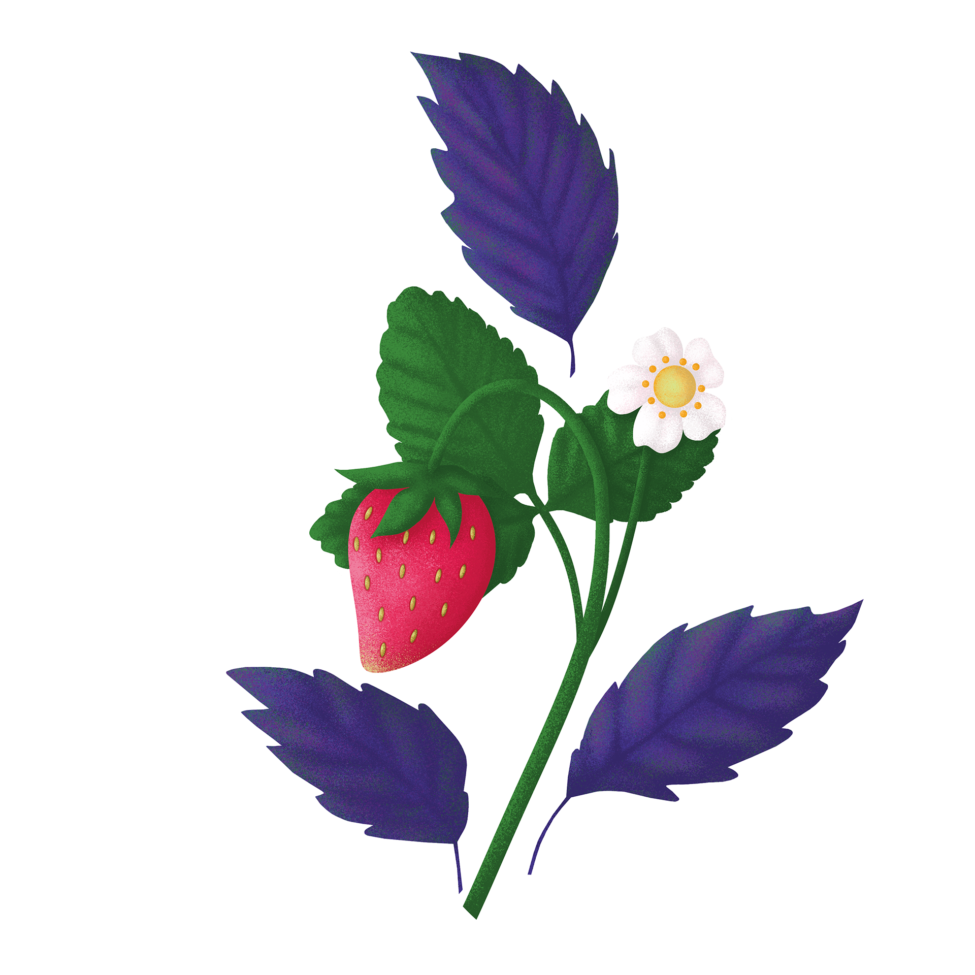
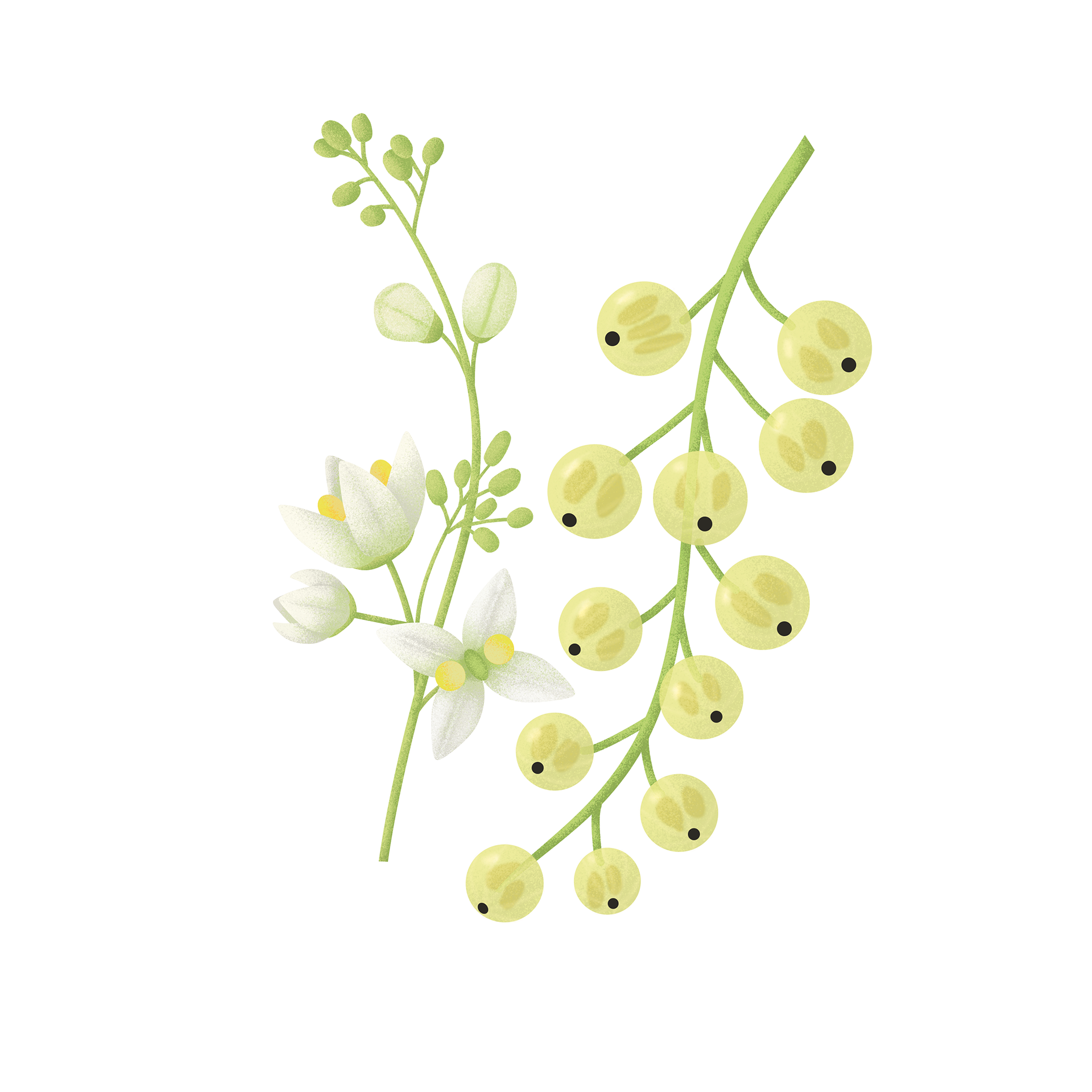
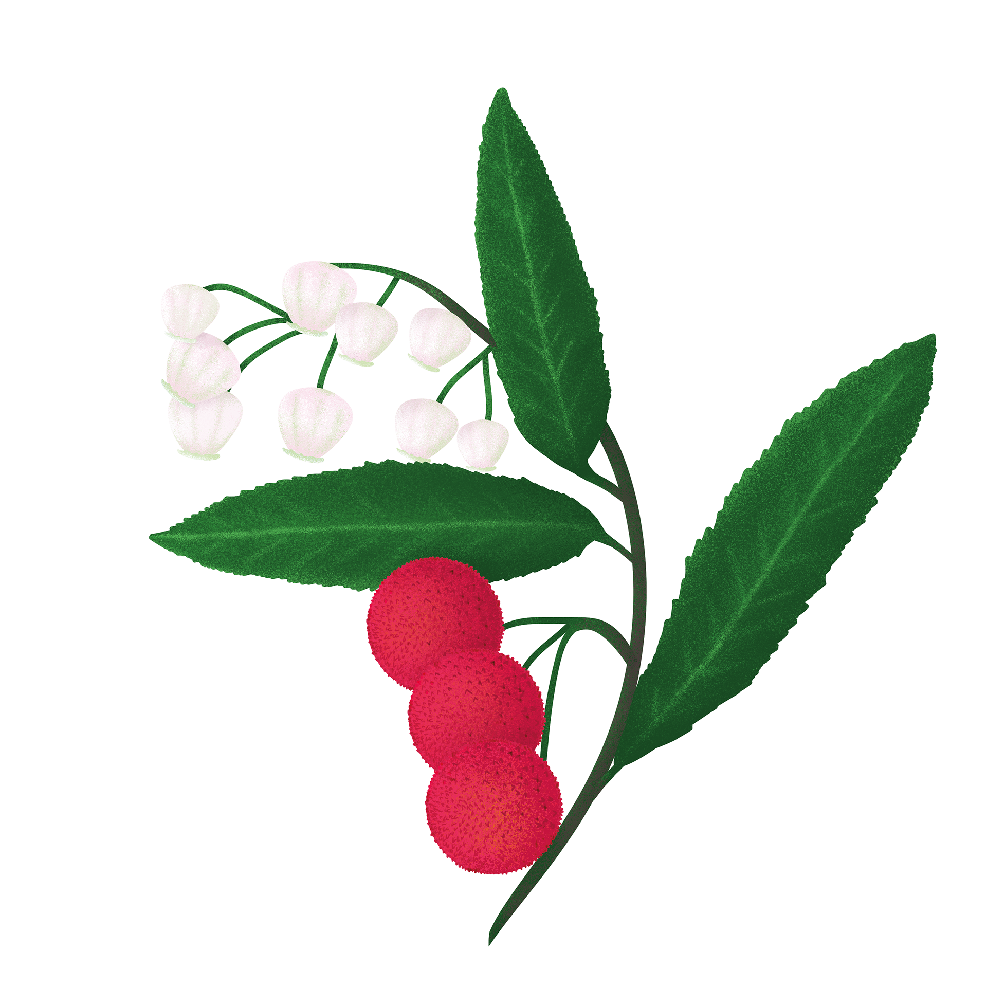
The labels blend painterly illustrations (created in Photoshop in my usual style) with a vector pattern made in Illustrator.
On the front, fruits emerge from small tag-like signs, similar to the ones you stick in the soil to mark what you’ve planted — a visual detail that evokes the charm of home gardens, brought to life with a modern illustrative touch.

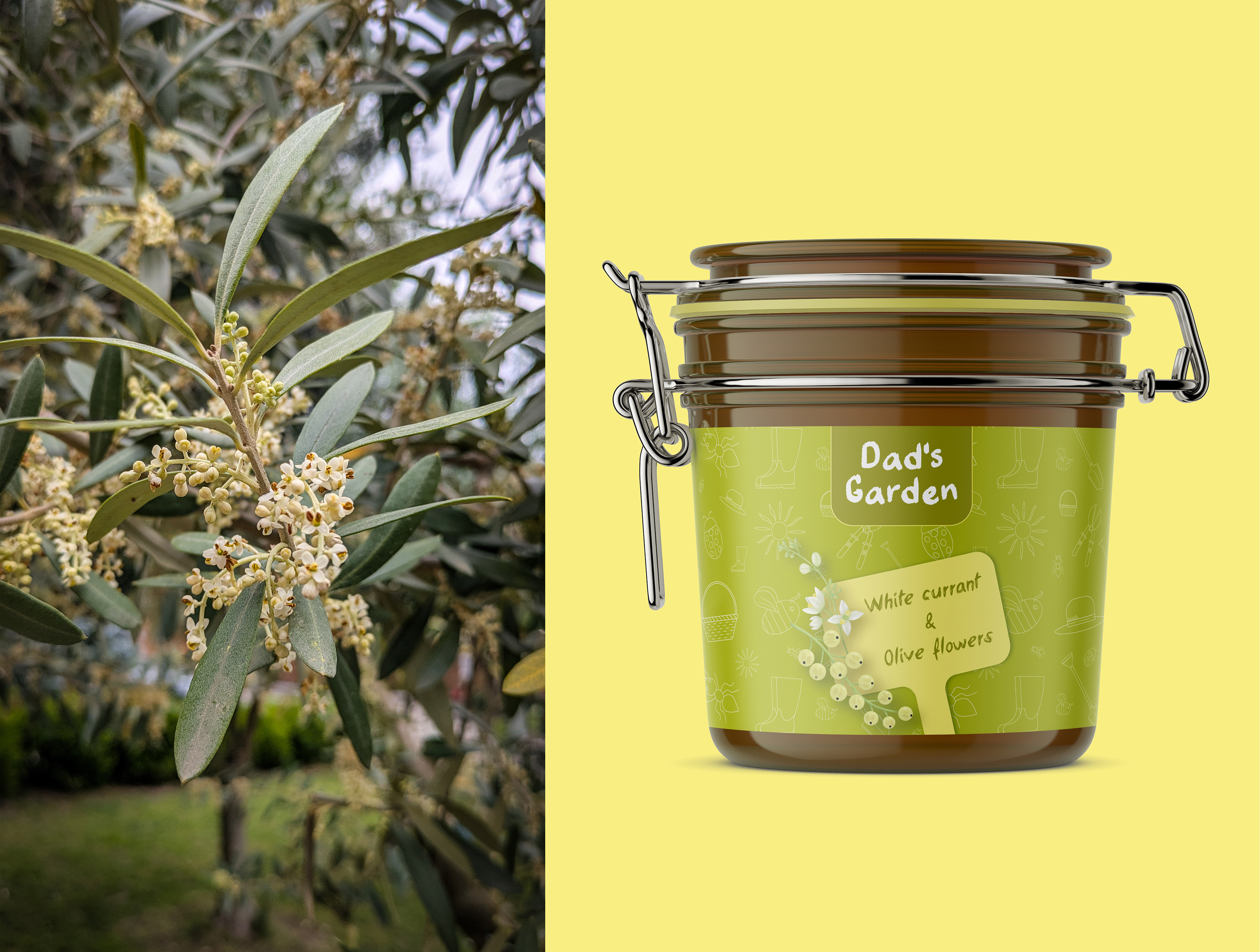
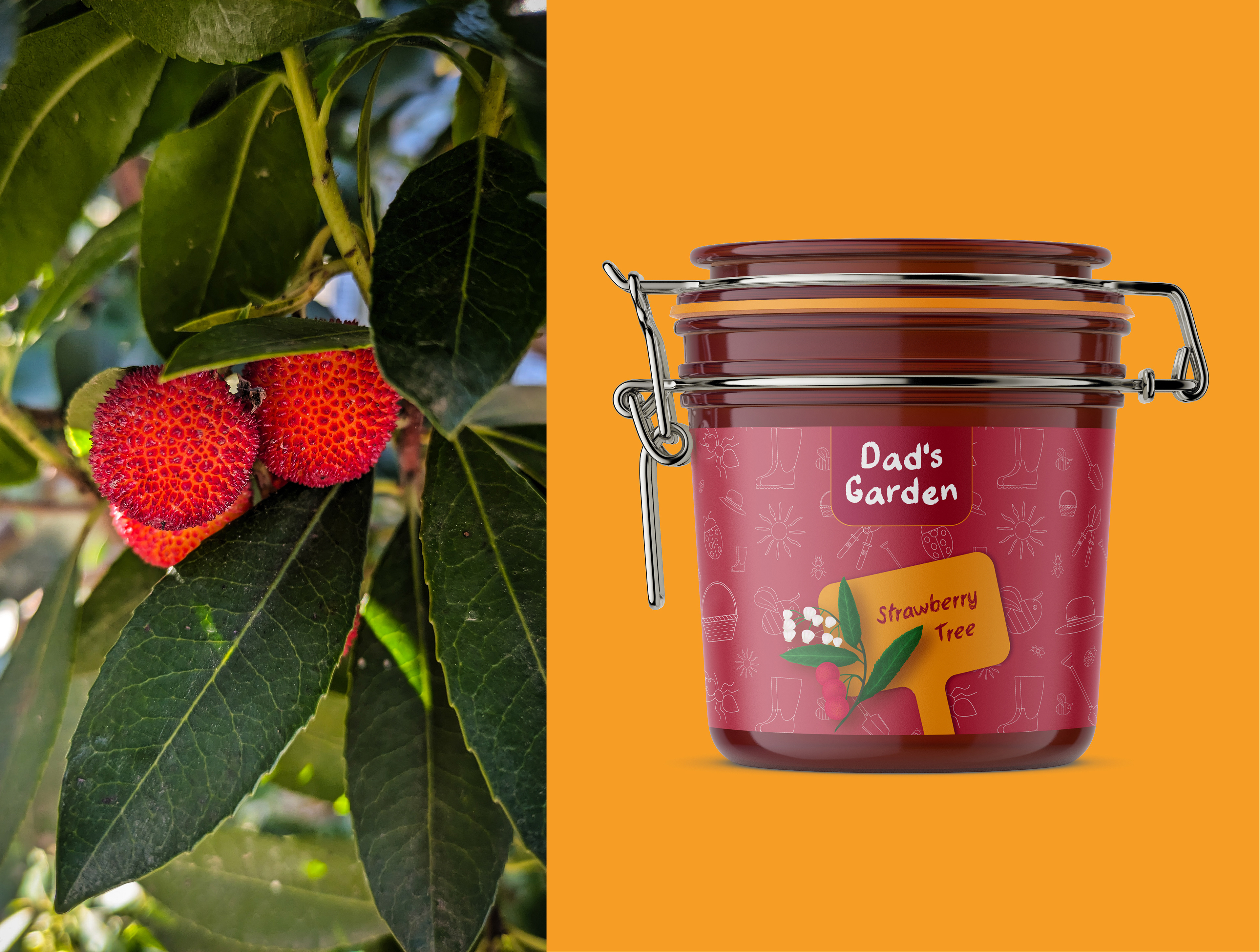
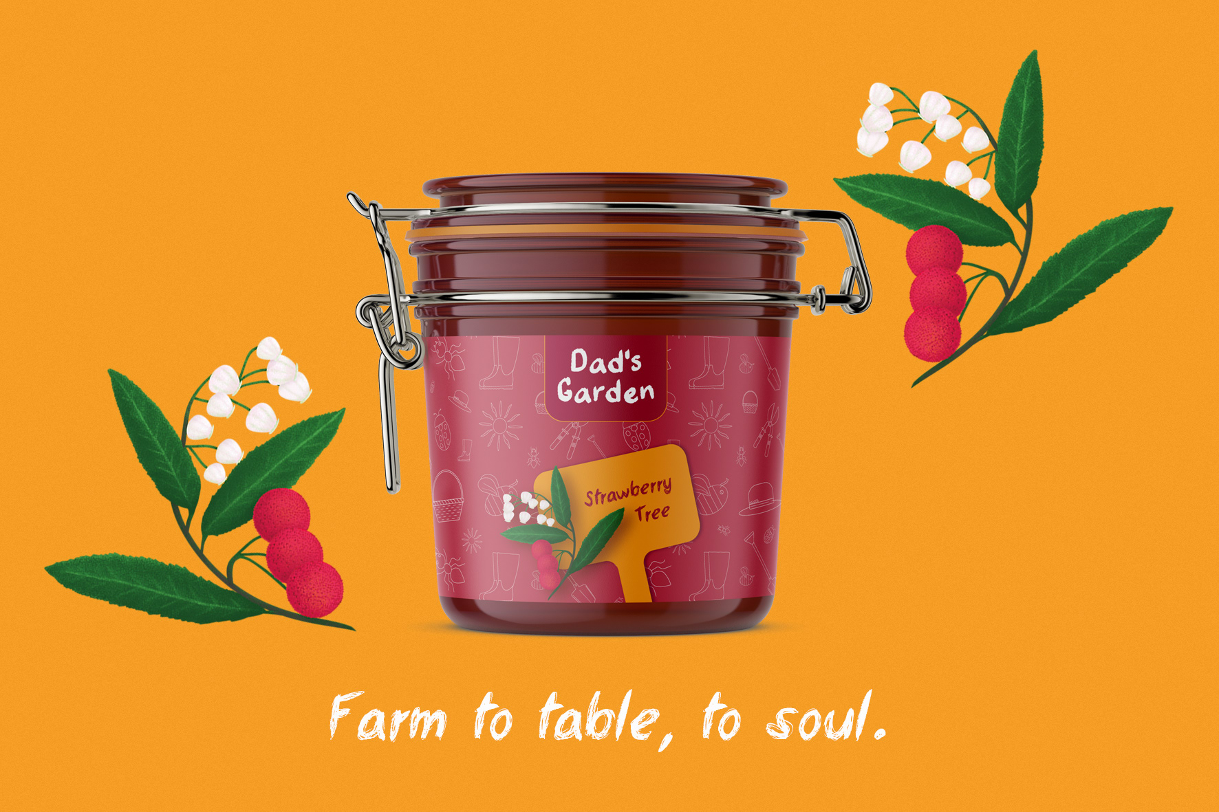
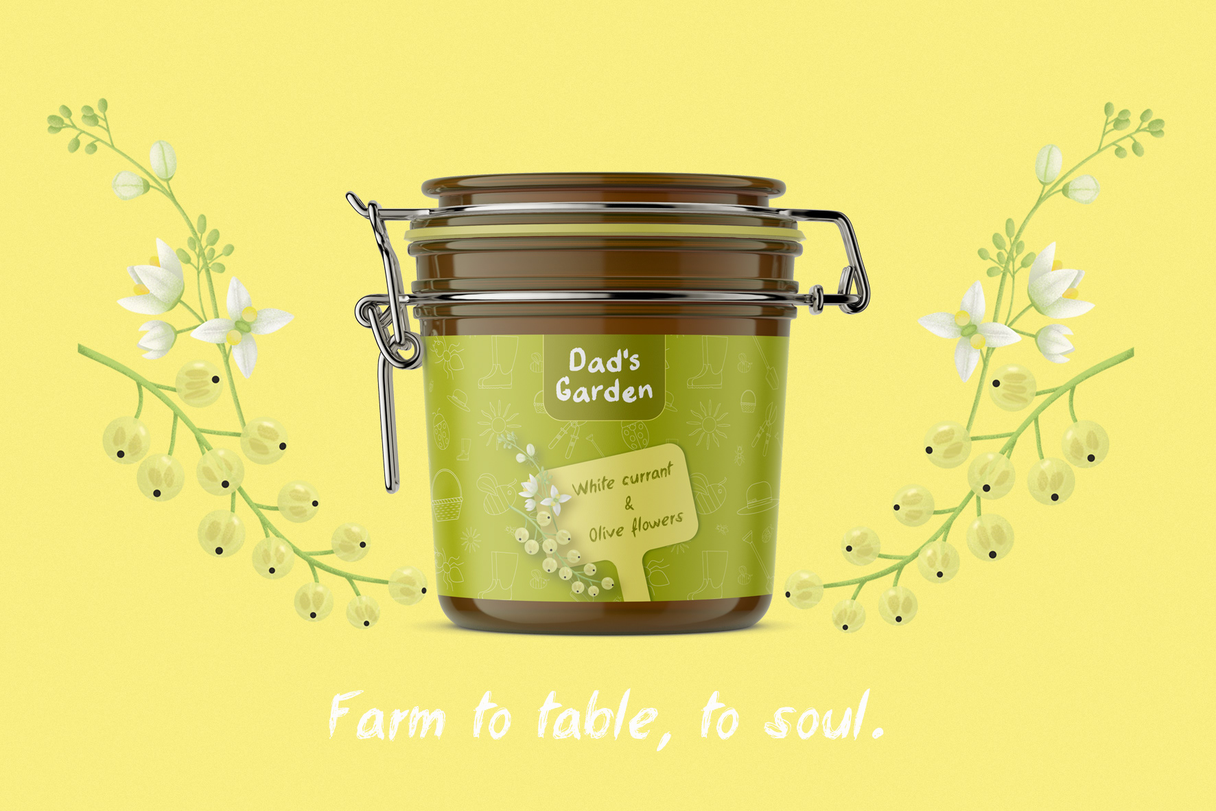
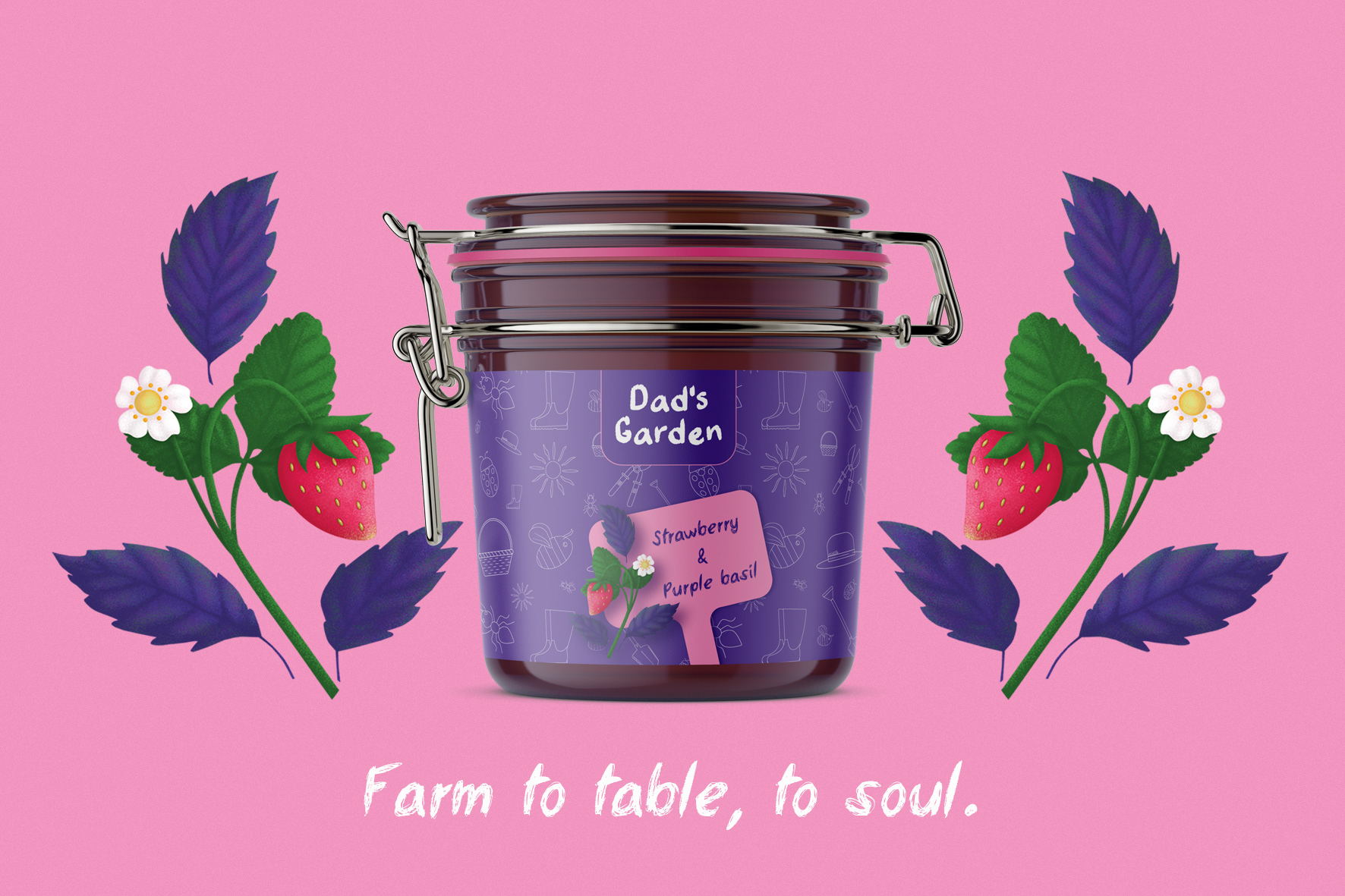
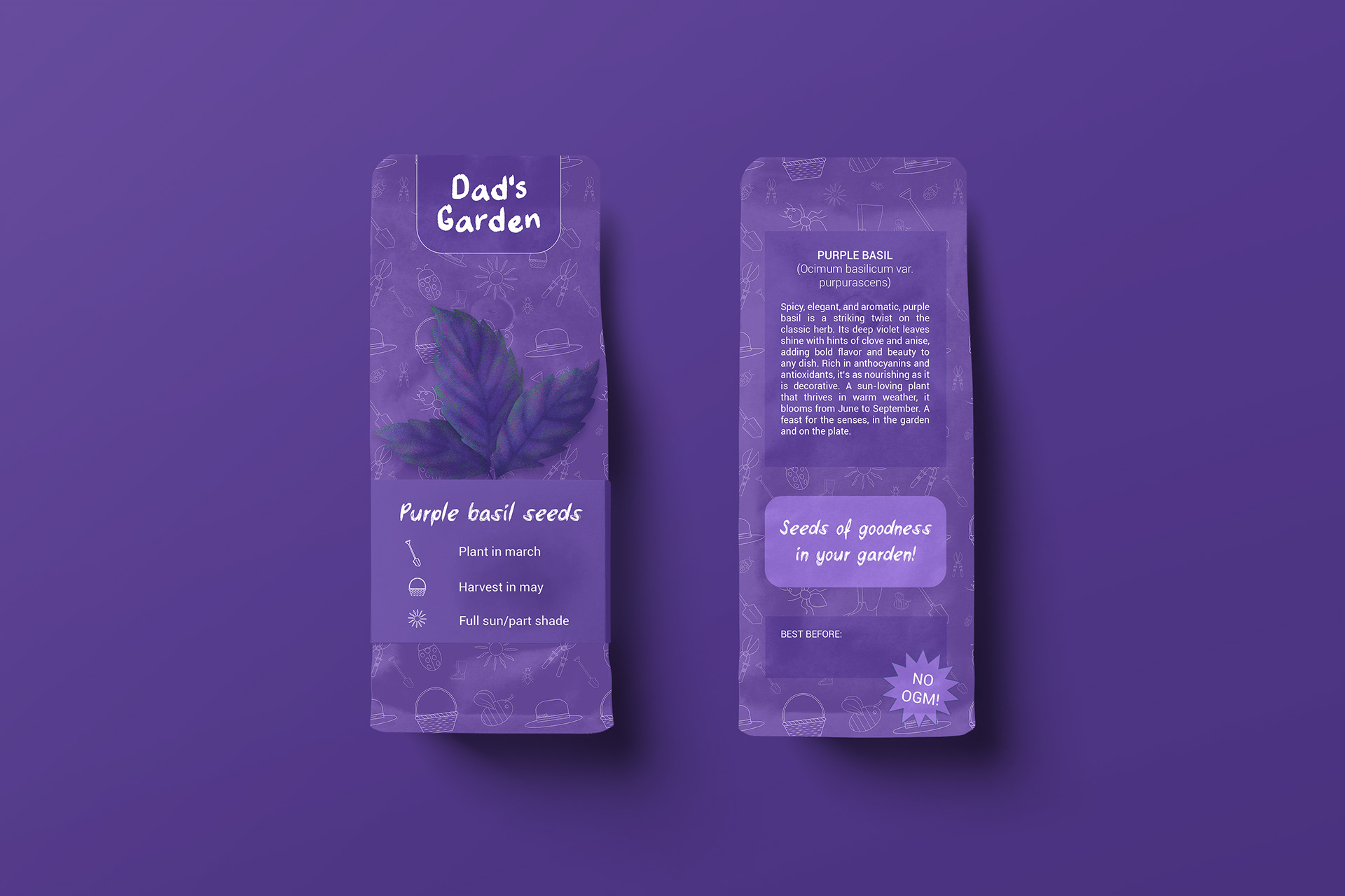
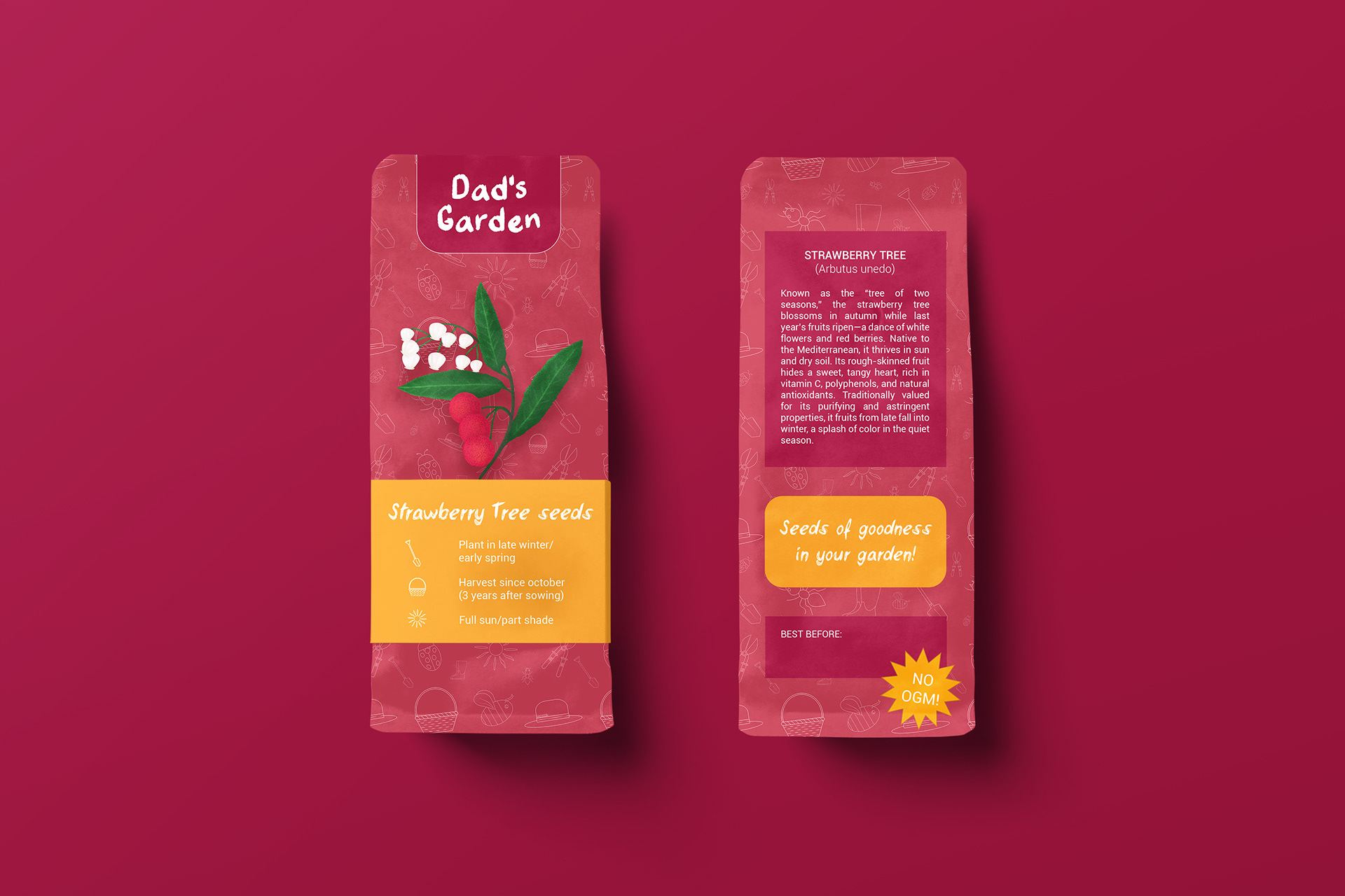
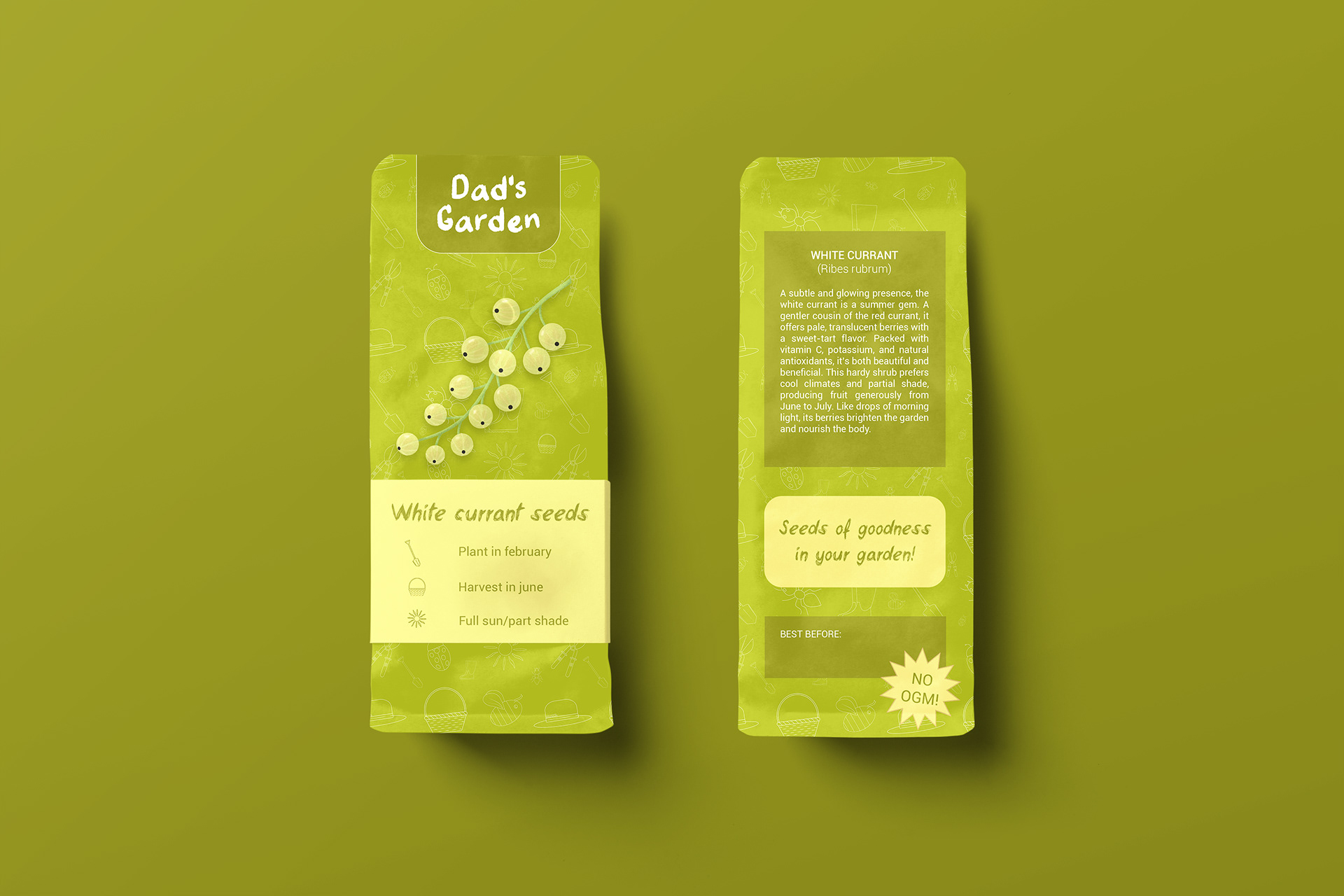
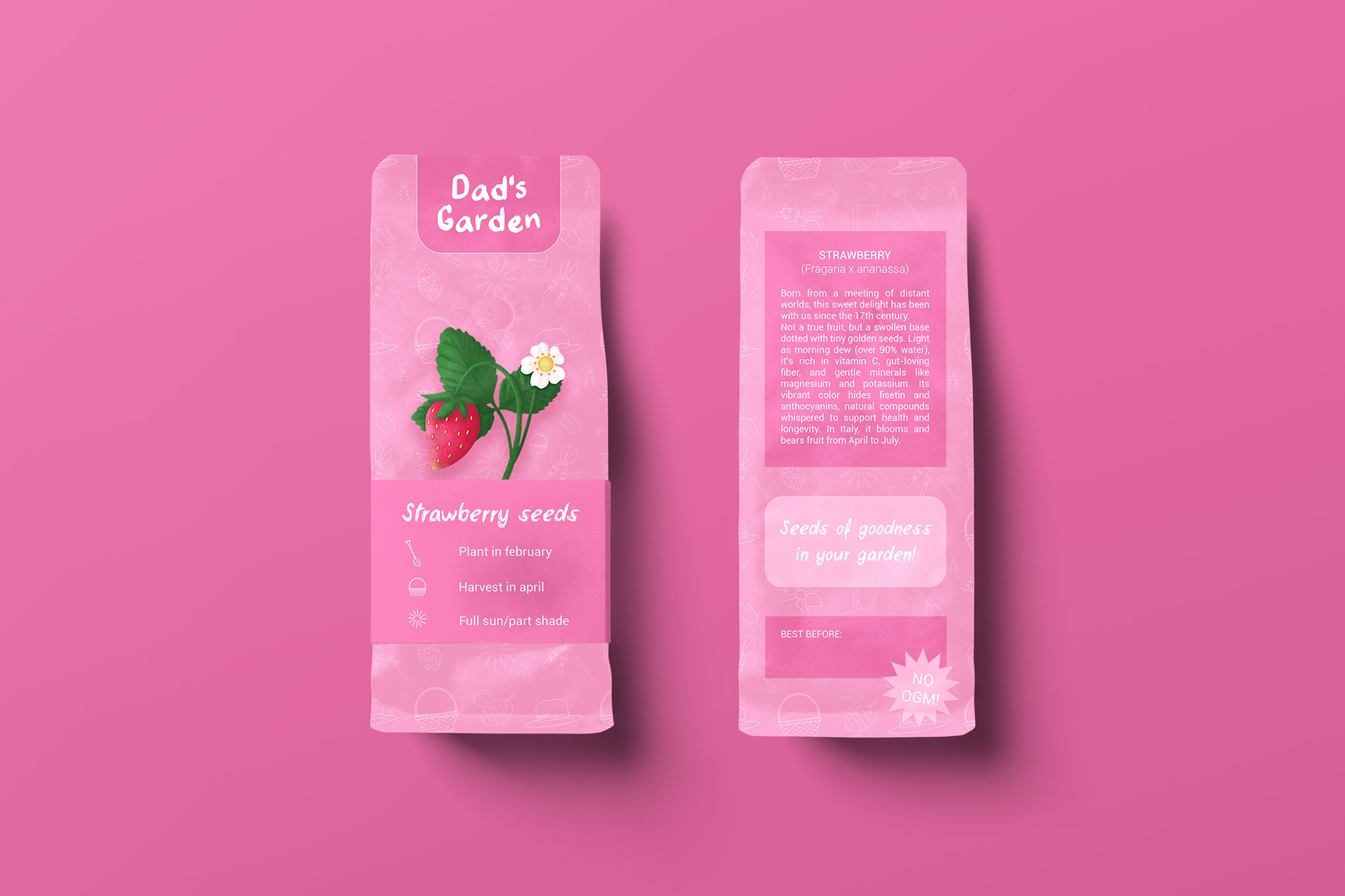
The pattern wraps around the label, telling the story of a tiny world made of simple tools: a shovel, a basket, a sunhat, rubber boots, and shears — alongside invisible but essential allies like bees, ants, and ladybugs — all under a sun that warms and helps everything grow.
The color palette draws from the symbolic hues of the featured fruits but reimagined with more saturated, vibrant tones, striking a balance between tradition and modern flair.
All the illustrations are designed to be versatile and can be used for other products that align with the project, take a look at these seed packets, for example!
_____________________________________
PACKAGING DESIGN; LABEL DESIGN; ORGANIC BRANDING 2025
Interested in collaborating?
I’d love to hear from you, reach out by email at divat.illustration@gmail.com
I’d love to hear from you, reach out by email at divat.illustration@gmail.com